
Show Art - Museum App with an inclusive social guide to connect people to art and art enthusiasts to each other.
From Research to a High-Fidelity Prototype.
My goal was to create an app for a public art museum to advertise exhibitions and events, provide museum information, and enable patrons to schedule visits.
Due to research, different kinds of accessibility have popped up. Some visitors would like to join various types of art venues but feel a social and financial barrier, as well as patrons who want to implement an inclusive and welcoming approach.
The goal shifted and evolved to a more visitor-centered application that provides an informative guide for everyone.
This app could work closely with health institutions and community centers, as the museum provides art therapy services and guidance on saving money.
This app could be used across multiple museums that want to participate, for better scheduling of programs.
User Flow of the first digital Prototype - Animation (“Friend”-User)
ShowArt is a mobile app that helps people explore art events in an inclusive, welcoming way — with personalized features for first-time visitors, friends, and patrons.
Note on Scope:
In the early paper wireframes, both “Friend” and “Patron” user roles were included at sign-up. For the first digital prototype and animation walkthrough, I temporarily removed the “Patron” flow to focus on building and testing the experience for “Friend” users.The “Patron” role was later reintegrated and explored further in the second iteration of the low-fidelity prototype, which served as the basis for the usability study and next design decisions.
UX Process
Personas / User Stories


Storyboard


Wireframes - paper
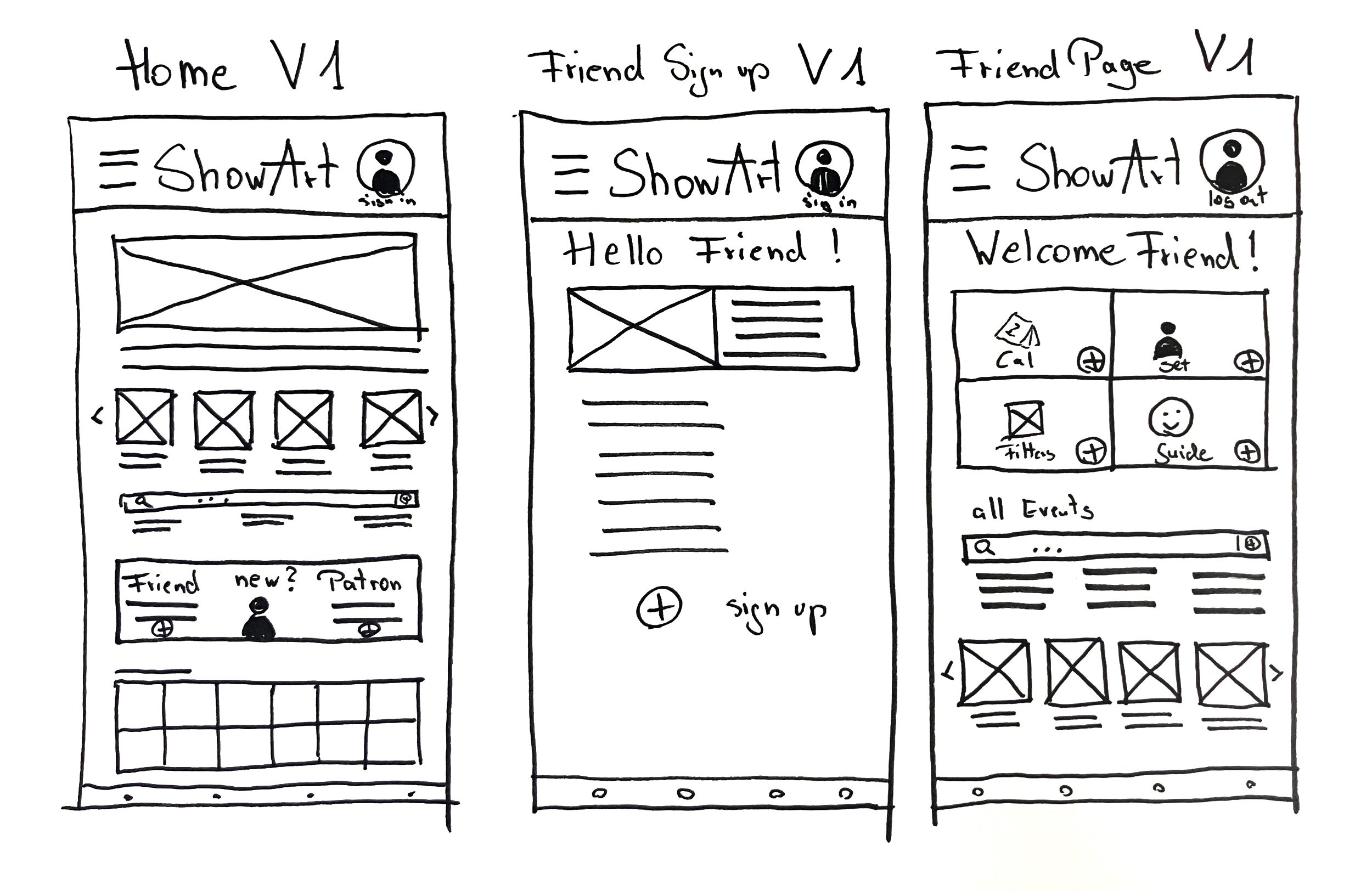
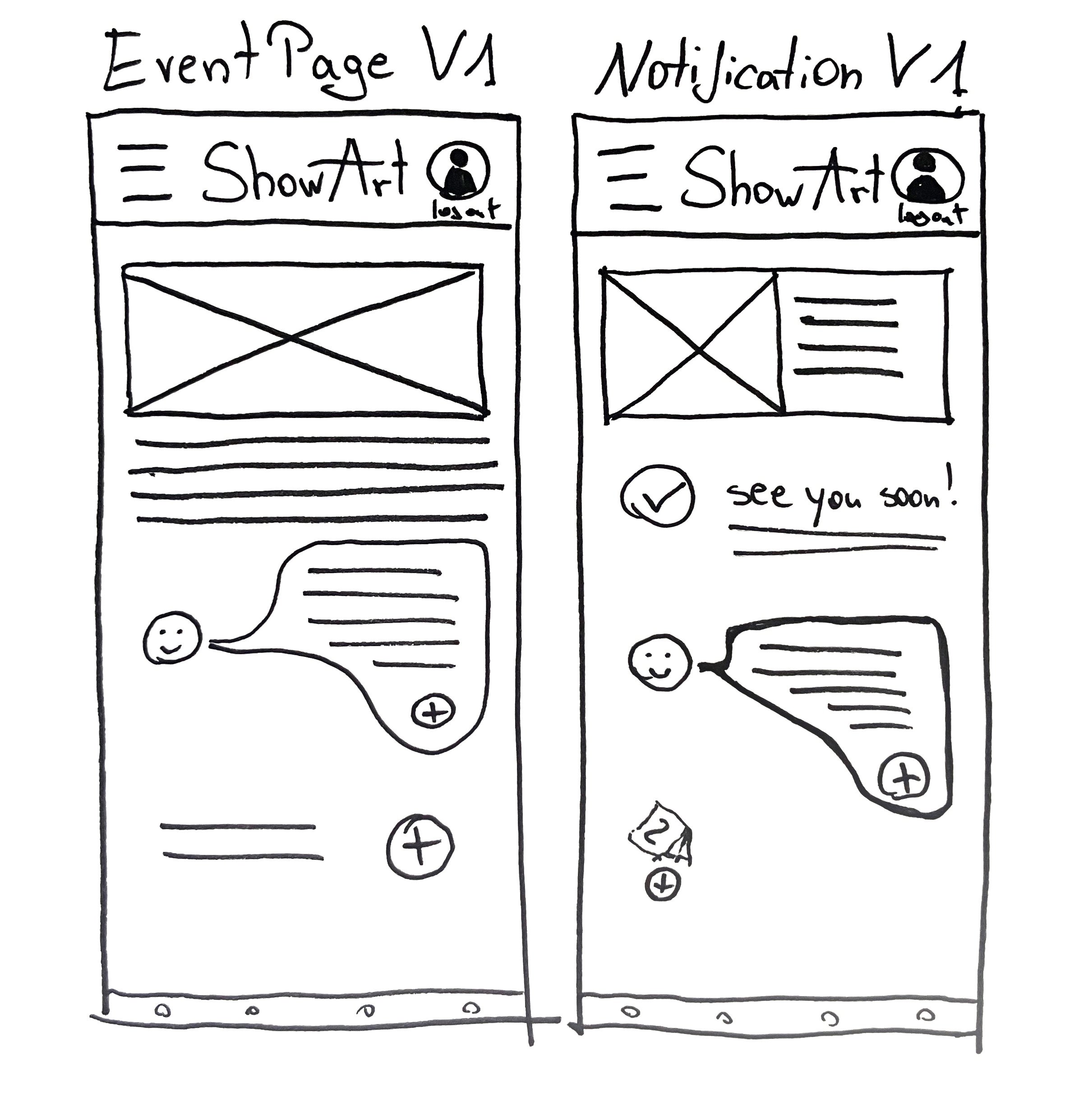
First Digital Wireframes


Wireframes - Connections

Prototype - interactive, try it :)
Focus on the main User and the Guide Tool for the first digital Prototype
After a first short feedback - study in a UX-Designers’ Forum
Improvements and Goals:
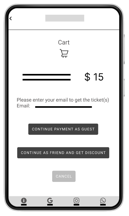
Simplified User Experience: Implemented a streamlined checkout process for visitors without requiring login to increase ticket sales.
Reintegrate Patron Access on the Homepage: foster a stronger connection with patrons.
Personalized Experience: Enhanced the experience for logged-in users with tailored recommendations and personalized calendars.
Improved Event Management: Introduced a user-friendly calendar for efficient event scheduling and management.
Usability Testing
Usability Testing Overview
To validate and refine the museum app prototype, I conducted remote usability tests with 5 participants from different backgrounds. I tracked every interaction across 6 key tasks, including ticket purchasing, calendar use, and exploring guided tours. Each session revealed valuable patterns, especially around scrolling behavior, menu clarity, and the overall sign-up flow.
What began as an inclusive tool for art access evolved further through user insights, helping me simplify navigation, remove friction, and reprioritize certain features for future testing.
Project Background
I’m creating a new app to easily access a museum’s program and purchase tickets. Also, to provide easy scheduling for patrons.
It’s about finding out if the main user flows are accomplished.
Study Details
Research Questions
How clear and efficient is the flow for buying tickets or making appointments?
Is the distinction between logged-in and logged-out flows helpful for visitors?
What can we learn, watching the user explore the app’s functions? (Qualitative)
Is the Guide useful?
Is the Calendar useful?
Participants
5 participants
Two males, two females, and one nonbinary participant
Age range: 18 to 75 years old
Methodology
up to 30 minutes
remote, Tool: Lookback.io (unmoderated, screen + voice)
Unmoderated usability study
(Supplemented usability recordings with Google Forms survey to capture quieter participants’ feedback and validate observed patterns.)
Users were asked to perform tasks in a low-fidelity prototype
Explore the detailed UX Research Study - Plan.
Prototype - interactive, try it yourself!
Usability Testing Summary
Participants: 5
Method: Click tracking & observation
To understand how users interact with the app, I created detailed click maps for each of the 5 participants — documenting every tap, hesitation, and backtrack across their sessions.
While the full logs are extensive, they helped reveal clear patterns, such as confusion on the homepage and friction in the sign-up flow.
You can view a sample participant log or see the summary insights below.
Participants
Patterns Identified
Scroll Awareness: Some participants struggled to realize that certain screens needed scrolling.
Scroll hesitation in a low-fidelity prototype:
A few participants didn’t realize the screen was scrollable. This was likely due to the prototype’s minimal visual hierarchy rather than a true UX issue. Based on secondary research, I chose not to introduce explicit scroll cues and instead improved layout rhythm to guide natural scrolling.
Menu Labeling: “Events” as a category confused multiple users when trying to locate Guided Tours.
Ticket Purchase Flow: Most users could complete the purchase, but the duality of “Simple Tickets” vs “Entry” was unclear.
Too prominent Sign Up: Most users seemed to be confused about the placement of the Sign Up function when searching for tickets
Guide Feature: Misunderstood or assumed to be part of the calendar; needs stronger naming and framing.
Triangulating Insights
To support and clarify findings from the usability recordings—especially for participants who spoke less during tasks—I also reviewed patterns in the post-study Google Forms survey. This helped validate earlier observations and ensured that quieter users’ experiences were still captured in the final insights.
Google Forms Survey Summary (Post-Usability Study)
Purpose:
To collect quick post-test reflections from all 5 participants after completing their usability session with the museum app prototype.
Key Findings from Responses
Overall Experience (Rating out of 5):
⭐️⭐️⭐️⭐️☆ (Most users rated it 4 out of 5 — generally positive)
Was the purpose of the app understandable?
Yes: 100%
→ Users clearly understood that the app is for finding and booking art events and museum visits.Was the ticket purchase process clear?
Mixed responses:Some found it simple
Others noted minor confusion or expected more guidance
Did you feel like the app welcomed all types of users?
Mostly yesComments suggested the tone felt open
A few users were unsure how “Friend” vs “Patron” roles worked at first
What feature did you like most?
Calendar, event overview, and the idea of personalized suggestions stood out.What confused you?
Scrolling behavior, finding Guided Tours, understanding the Guide Tool
Takeaway Summary for Case Study
In a short post-test survey, participants rated the overall experience 4/5 on average. They clearly understood the app’s purpose and appreciated features like the calendar and event previews. Some noted initial confusion around scrolling, the Friend/Patron structure, and the Guide Tool. These results aligned with the recorded usability findings and helped guide feature prioritization and flow improvements.
When you’re curious, here are the results in diagrams.
Conclusion Usability Study
Most users hesitated at the homepage due to competing CTAs
The guide feature caused confusion (low engagement, unclear value)
Ticket selection felt too early — users preferred seeing events first
Key Findings
Actions Taken
Prioritized events/museum’s program on homepage
Moved sign-up deeper into the flow
Temporarily removed guide for refinement and future A/B testing
Curious about the testing process?
After
Steps of Improvement
Priority 0 - must fix issue:
Most participants had problems to find the tickets
Priority 0 - must fix issue:
Most participants seemed to be annoyed by the Sign-Up options
Priority 2 - can be fixed in next steps:
Almost all participants didn’t understand the Guide-Tool


Easier to find the program /events. Clear hierarchy of the CTAs.
Sign-up is less dominant.
The main entry is easy to find, if needed.
Guide-Tool is temporarily removed
Before
Before
After
Priority 1 - should be fixed soon:
Sign-up options were too early on the homepage

Sign-up option is moved to the point where it’s a natural part of the user flow.
Before
After
Priority 2 - can be fixed in next steps:
A few participants liked the “Calendar”- Function, but didn’t know from the start what it does.


Unlike typical calendars that just remind you of events, this calendar stores your tickets directly — including entries from events, exhibitions, and invitations.
No switching between apps or wallets. Everything you need is in one place — and accessible even if you forget your phone.
Improve the user flow of purchasing tickets
Merging screens for a better understanding of the user flow of finding an event, choosing a ticket, signing up, or signing in, and paying
Reintegrate the Guide for refinement and future A/B testing in one of the next iterations
Next Steps
Hi-Fidelity Preview
One challenge was balancing access to event content with the need to guide users toward signing up as Friends (Members) or Patrons. Initially, the sign-up CTA competed with the event listings. I reorganized the homepage to prioritize upcoming events while introducing benefits at a later, more relevant step in the flow.
I temporarily removed the social guide feature based on mixed user feedback and early visual limitations. I plan to revisit this in a future A/B test using a more polished prototype.
Another challenge was choosing an appropriate design that is clear, inviting, and accessible.
Select screens below reflect the final visual style (yellow/black theme) and core improvements based on usability testing. Additional screens are in development.
Updated Ticketing Flow
I extended the prototype to cover the full ticket purchase flow, including a streamlined “Join as Friend & Get Ticket” experience.
The user can now explore pricing tiers, sign up for membership, and purchase event tickets in one intuitive path — all with a focus on clarity, accessibility, and optionality.
The goal was to reduce friction while reinforcing the value of becoming a Friend or Patron without overwhelming first-time visitors.
What I’d do next
To complete the app, I plan to finalize the Friend and Patron profile pages, expand the full event program, and explore guided content options through user testing and A/B flows.
I’d also like to refine visual identity across modes (light/dark) and eventually connect the system to a real event calendar to test real-time behavior and engagement.


