MUSEUM APP - SHOW ART - CASE STUDY
Show Art — an inclusive museum app, from Research to a High-Fidelity Prototype
My initial goal was to design an app for a public art museum that promotes exhibitions and events, shares essential museum information, and lets patrons schedule visits.
Through research and conversations, broader accessibility needs emerged: visitors who want to attend but face social or financial barriers, and patrons committed to a more inclusive, welcoming approach. The project evolved into a visitor-centered guide for everyone—clear, supportive, and easy to use.
The app also opens paths for collaboration with health institutions and community centers, supporting art therapy initiatives and offering budget-friendly guidance for visiting.
Goals
Make art events accessible to all, spark in-person participation, strengthen social connection, and grow the ecosystem through sponsorships and new venues.
Challenges
Create an intuitive app that provides technical and visual help and encouragement to enter the world of art. Discover how much Art can improve people’s lives in social and health terms.
Structure
The following sections present the process of how this app evolved.
The main tool during the creation of the app was user research. The idea began as a random assignment in a UX course, which served as the kickoff for initial research that led to user personas and user stories, and the first development of simple paper wireframes. These evolved into a Low-Fidelity Prototype that could be tested.
This cycle was repeated and resulted in a tested High-Fidelity Prototype as the outcome of the whole UX process (following the cycle of Empathize, Define, Ideate, Prototype, and Test).
Finding test volunteers was very demanding. The research mix included secondary, qualitative, and quantitative methods. Qualitative methods were dominant, as they provided the most insights.
UX Process
Personas / User Stories


Storyboard


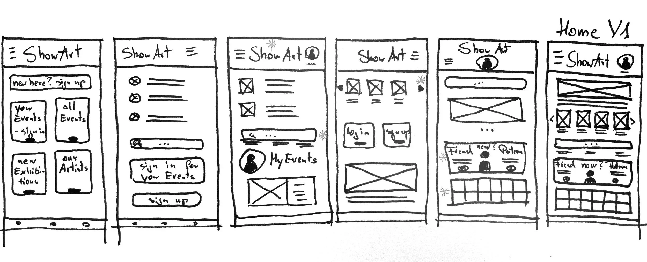
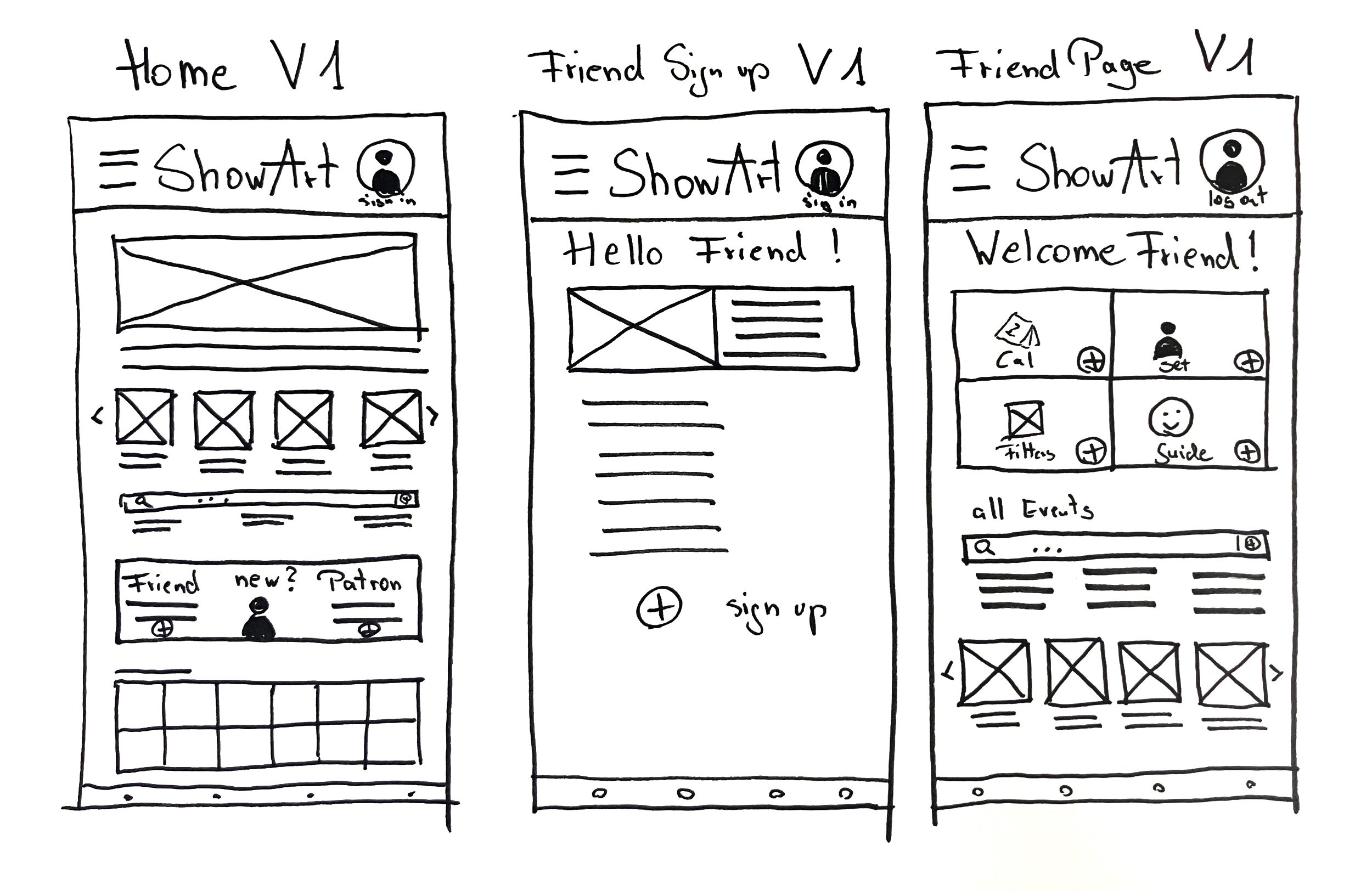
Wireframes - paper
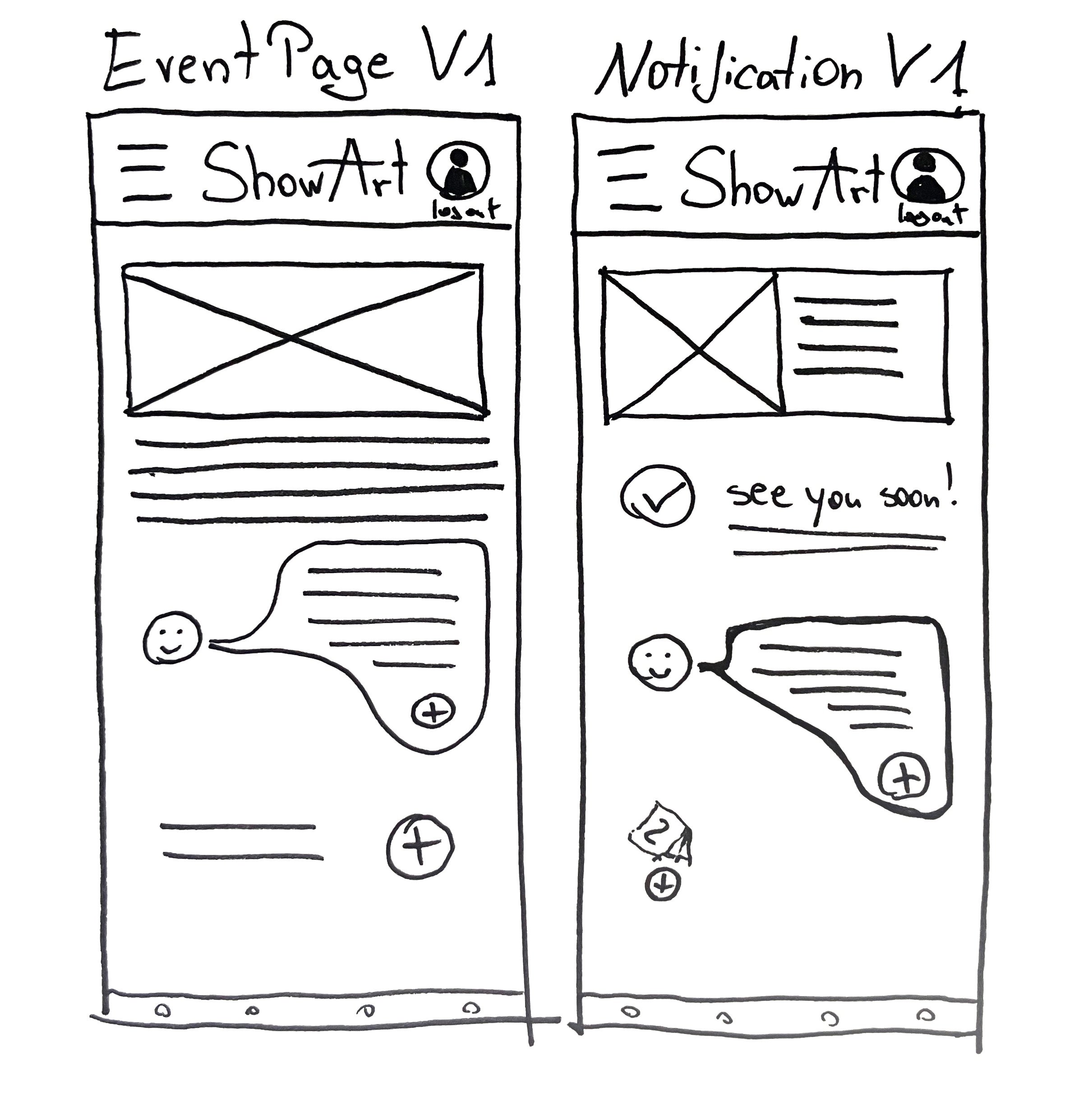
The main purpose of the app is to be inviting and easy to use. Being only beautiful and sterile is counterproductive when the goal is access for everyone.
There should be a balance between showcasing art and enabling users to quickly scan and use the app for targeted tasks.
The app should also make clear that low income or unfamiliarity with the art scene is not a reason to stay away from museums and what they offer (e.g., workshops, music, literature, and art therapy).
The main user flow is to purchase a ticket signed in as “Friend”, to get the financial benefits.
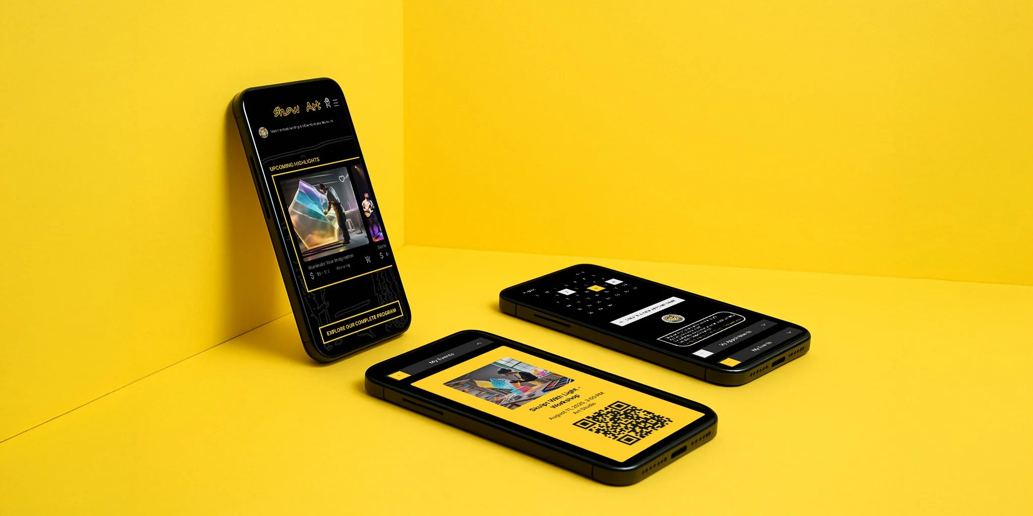
User Flow of the first digital Prototype - Animation (“Friend”-User)
ShowArt is a mobile app that helps people explore art events in an inclusive, welcoming way — with personalized features for first-time Visitors, Friends, and Patrons.
Note on Scope:
In the early paper wireframes, both “Friend” and “Patron” user roles were included at sign-up. For the first digital prototype and animation walkthrough, I temporarily removed the “Patron” flow to focus on building and testing the experience for “Friend” users.The “Patron” role was later reintegrated and explored further in the second iteration of the Low-Fidelity Prototype, which served as the basis for the usability study and next design decisions.
First Digital Wireframes


Wireframes - Connections

Usability Testing I
A first usability study in a UX Designers’ Forum
Tool: Low-Fidelity Prototype
Feedback: Comments
Goals and Improvements:
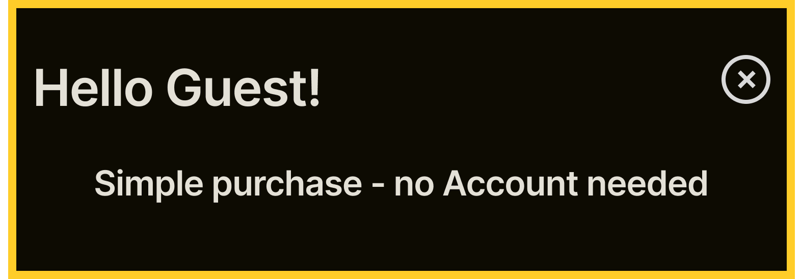
Simplified User Experience: Implemented a streamlined checkout process for visitors without requiring a login to increase ticket sales.
Reintegrate Patron Access on the Homepage: foster a stronger connection with Patrons.
Personalized Experience: Enhanced the experience for logged-in users with tailored recommendations and personalized calendars.
Improved Event Management: Introduced a user-friendly calendar for efficient event scheduling and management.
Qualitative Research - Usability Testing Overview
Tool: Low-Fidelity Prototype
Feedback: Screen Recording, Surveys
To validate and refine the museum app prototype, I conducted remote usability tests with 5 participants from different backgrounds. I tracked every interaction across 6 key tasks, including ticket purchasing, calendar use, and exploring guided tours. Each session revealed valuable patterns, especially around scrolling behavior, menu clarity, and the overall sign-up flow.
What began as an inclusive tool for art access evolved further through user insights, helping me simplify navigation, remove friction, and reprioritize certain features for future testing.
Here’s a short overview of all identified patterns across all participants
Patterns Identified
Scroll Awareness: Some participants struggled to realize that certain screens needed scrolling.
Scroll Hesitation in a Low-Fidelity Prototype:
A few participants didn’t realize the screen was scrollable. This was likely due to the prototype’s minimal visual hierarchy rather than a true UX issue. Based on secondary research, I chose not to introduce explicit scroll cues and instead improved layout rhythm to guide natural scrolling.
Menu Labeling: “Events” as a category confused multiple users when trying to locate Guided Tours.
Ticket Purchase Flow: Most users could complete the purchase, but the duality of “Simple Tickets” vs “Entry” was unclear.
Too prominent Sign Up: Most users seemed to be confused about the placement of the Sign Up function when searching for tickets
Guide Feature: Misunderstood or assumed to be part of the calendar; needs stronger naming and framing.
Conclusion Usability Study
Users hesitated on the homepage due to competing CTAs.
Ticket selection felt too early — users preferred seeing events first.
Key Findings
Actions Taken
Prioritized events/museum’s program on homepage
Moved sign-up deeper into the flow
Curious about the testing process?
Steps of Improvement
Priority 0 - must fix issue:
Most participants had trouble finding tickets
Priority 0 - must fix issue:
Most participants seemed to be annoyed by the Sign-Up options
Priority 2 - can be fixed in next steps:
Almost all participants didn’t understand the Guide
Before

After

Easier to find the program /events. Clear hierarchy of the CTAs.
Sign-up is less dominant.
The main entry is easy to find, if needed.
Guide is temporarily removed (better depiction in high-fidelity visuals)
Proof:
Users reached tickets faster (fewer backtracks observed).
Fewer pauses on the homepage.
Priority 1 - should be fixed soon:
Sign-up options were too early on the homepage
Before

After
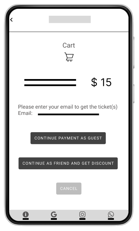
Sign-up option is moved to the point where it’s a natural part of the user flow.
Priority 2 - can be fixed in next steps:
A few participants liked the “Calendar”- Function, but didn’t know from the start what it does.
Before

After

Unlike typical calendars that just remind you of events, this calendar stores your tickets directly — including entries from events, exhibitions, and invitations.
No switching between apps or wallets. Everything you need is in one place — and accessible even if you forget your phone.
High-Fidelity Iterations
Continue to remove distractions to put the main focus on the main button and the program of the museum.
One challenge was balancing access to event content with the need to guide users toward signing up as Friends (Members) or Patrons. Initially, the sign-up CTA competed with the event listings. I reorganized the homepage to prioritize upcoming events while introducing benefits at a later, more relevant step in the flow.
Updated Ticketing Flow
Improve features
Improve clarity of the design
Merging screens for a better understanding of the user flow of finding an event, choosing a ticket, signing up, or signing in, and paying
The user can now explore pricing tiers, sign up for membership, and purchase event tickets in one intuitive path — all with a focus on clarity, accessibility, and optionality.
The goal was to reduce friction while reinforcing the value of becoming a Friend or Patron without overwhelming first-time visitors.
Offer more paths to accomplish a purchase. Added a shortcut path to just put it directly in the cart and pay - For people who know exactly what they search for and need no further information.
Better explanation of the Cart function for Friend members. A cart can be “programmed” to make reservations for rare events.
Improvement of the put-in-cart animation.
Extended the Guide features from answering questions to managing account settings via chat. Provide a better usage explanation for handling the Guide.
Another challenge was choosing an appropriate design that is clear and accessible. It’s bold, but inviting, universal, but specific for brand recognition.
Concept refinement: Yellow frames with art inside - for being scrolled horizontally or vertically, or being clicked on. As the purchase process progresses, there’s more yellow in the design.
White frames with rounded corners or speech bubbles lead to interaction with the Guide.
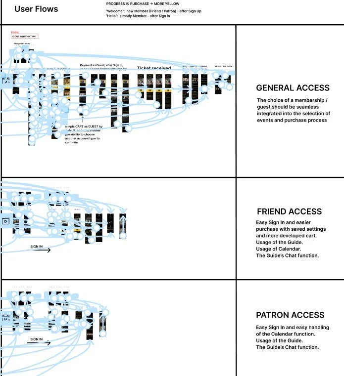
Due to the size of the project, I created 3 User Flows:
General Access:
The choice of a membership/guest should be seamlessly integrated into the selection of events and the purchase process.
Friend Access:
Easy Sign In and easier purchase with saved settings and more developed cart.
Usage of the Guide.
Usage of Calendar.
The Guide’s Chat function.
Patron Access:
Easy Sign In and easy handling of the Calendar function.
Usage of the Guide.
The Guide’s Chat function.
Usability Testing II
Qualitative Research - Usability Testing Overview
Tool: High-Fidelity Prototype
Feedback: Observation, moderated conversation, short post-task questionnaires
Research goals
Evaluate the clarity and usefulness of the app’s core tasks.
Identify opportunities to streamline, merge, extend, or remove features/steps.
Surface unforeseen difficulties and understand the end-to-end user experience.
Research questions
Are logged-in vs logged-out flows clearly distinguished and genuinely helpful for visitors?
How discoverable and helpful is the Guide (qualitative insights)?
How useful is the Calendar for planning and attendance?
How clear and efficient is the ticket/appointment flow (steps, errors, time to complete)?
Does the navigation/menu provide a clear overview or create overload? If overloaded, what should be collapsed, renamed, or removed?
Curious about the testing process?
Steps of Improvement
Before
After
Priority 0 - must fix issues:
Many users tried intuitively to click on the “Guest”, “Friend”, or “Patron” images with prices before selecting below how to proceed. In fact the broad information about those roles is more extensively explained during and after purchase, but not here at the start.
I made the images tappable and aligned the info with later steps.
Avoiding dark UX patterns and early informing the user about the role of a Patron in making donations to receive free entry.
There are additional secondary buttons at the bottom of the screen to enable better navigation or cancellation of the process. Multiple items can be added to the cart in every stage of the purchase before payment.
Before
After
Priority 1 - must fix issues:
Users are glad about the summary of tickets and payment in one place, but the sections need more structure to be quicker to scan.
The price has to be emphasized.
There are additional secondary buttons at the bottom of the screen to enable better navigation or cancellation (x on top) of the process. Multiple items can be added to the cart in every stage of the purchase before payment.
It’s still possible to change the role and sign up or sign in.
After
Priority 1 - should be fixed soon:
Finding (data)
Users want access to the Guide without signing in. A sign-in wall blocks exploration (1 participant said this explicitly; 2 more implied it by asking role-clarifying questions).
Theme
Provide earlier, easier access to the Guide.
Insight
Let newcomers start with the Guide chat to reduce overwhelm; defer account requirements until actions truly need them.
Recommendation
Make the Guide accessible from the start (welcome screen/onboarding + persistent entry point).
Enable guest mode for the Guide chat; gate only transactional actions (save, RSVP/buy, book) behind sign-in.
Ask 1–2 quick role questions in the Guide to tailor guidance (Guest, Friend (member), Patron (sponsor/member), etc.).
After

Priority 2 - can be fixed in the next steps:
Prototype polish (not product scope changes)
Calendar (Patron scheduling): Refine time/duration controls (clear start/end labels, quick presets). Usage is already clear; this is a prototype usability improvement, not a feature change. (-> image above)
Event cards: Add a direct-purchase affordance (ticket icon or small “Buy” badge) on every event tile. Usage is mostly clear; this speeds recognition in the prototype without changing app logic. (-> Prototype)
Icons: Replace ad-hoc symbols (e.g., “$”) with consistent Material Symbols to improve visual scan and cohesion. (-> Prototype)
Design System
Sticker Sheet
Try the interactive Prototypes!
3 User Flows
General User Flow
Friend (Member) User Flow
Patron (Member) User Flow
Takeaways
This was my first project entirely based on user feedback, the design thinking cycle, and a user-centered approach. Incorporating feedback throughout the process, rather than relying on assumptions, greatly enriches the results.
I’d love to see the app in action as a helpful tool to lower barriers and demonstrate how beneficial it is to be immersed in art and surrounded by creators. It encourages people to actively participate in various workshops and events and to incorporate art into their lives.
Since the app aims to bring people together and enhance their well-being, it could be supported and promoted by community centers. Finding Patrons who support low-cost and free-entry events would also be beneficial.
Variants
During the process


Future Explorations
As an architect-turned-UX designer, I’m always thinking in space—both visual and experiential. While developing Show Art, two speculative directions emerged:

The Interactive Section
Inspired by architectural sections and cinematic staging, this concept reimagines each page of the app as a spatial composition—like stepping into a designed moment. Think: a curated “room” for each function, with visual metaphors and interaction flow embedded into the architecture of the scene.
The Virtual Tour
A secondary, more immersive experience. Here, the museum becomes a 3D environment users can navigate, with real-world or fictional galleries, carousel-style previews of upcoming events, and subtle UX triggers. More than a feature—this could serve as a companion experience for curious or returning visitors.